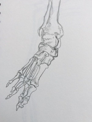
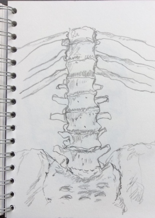
This blog is now closed to new entries

31 August 2016

With the completion of “Textiles 1: Exploring ideas”, I have decided to make no more entries in this blog. My sketchbook work will now be amalgamated within my main coursework blog. Please refer to the following link: “Textiles 1: Mixed media for textiles”

A series of tree-related experiments and sketches

6 June 2016

I have started to develop some of my ideas from my work on the ash tree branches and I have been collecting tree-related photographs and making drawings and analogies in support of Textiles 1: Exploring ideas, Assignment 5, Personal project.

Ash tree branch:

I took the initial pen and ink drawing –
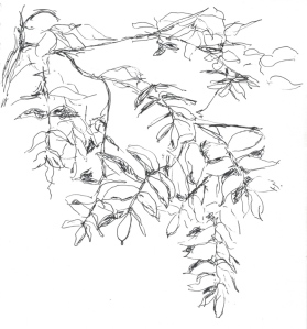
Ash.jpeg

I did some experimentation with free-machine embroidery, using plain black thread on paper, just to see how the marks compared with pen and ink. The results are shown below:

I was quite surprised at just how similar the machine stitching was as a mark-making technique. Having done very little machine embroidery, it took me a while to get used to controlling the direction of the needle, but I am quite pleased with the results for a first attempt.

I then decided I would copy the image using my inkjet printer scanner and experiment with adding texture by machine embroidering over the printed outline (again on paper). The results are shown below:
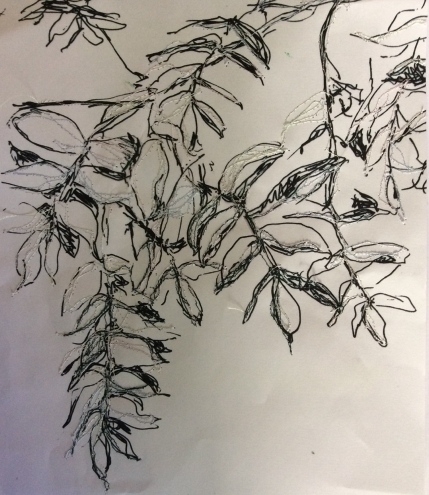
The top thread was a very pale machine embroidery thread, so does not have much impact on overall shading/colour, although it does add an interesting textural element. I purposely let the machine needle stray outside the leaf outlines because I think this adds to the impression of foreground and background.

My plan for further exploring this idea is to think about colour and how it could be introduced/combined (see my previous post). Also, I might consider the method of outlining, think about fabric or paper as alternatives backing materials and revisit layering.

First thoughts on the Plane tree leaf:

A friend on Facebook posted the photograph below and was kind enough to give me permission to use it for my textile work:

(Photograph above: copyright of Paul Mead)

The water droplets are interesting, but my first thoughts were regarding the prominent veins and the contrast between the glossy, waxy leaf and the textured soggy earth. The angular shapes of the outline also caught my eye, being instantly recognisable as a leaf-form.

My first analogy was an experiment using Japanese paper and hand-stitching. I either trapped different thicknesses of yarn between running stitches, or just trapped a fold of paper between the stitches. I wanted to see if I could create the shapes of the leaf ribs and discover how the paper would respond to being manipulated in this way.


I’m really pleased with this analogy. The paper has crumpled, adding to the likeness. Naturally, the next stage would be to introduce colour, maybe by screen or inkjet printing. However, my aim is not to attempt to recreate a representation of the leaf in textiles, so I am thinking firstly towards abstraction – maybe cutting sections, joining different pieces with stitching, or using different colours or materials (be they fabric, laminate or paper). Some sketching work will probably be needed first, to explore composition.

Pine tree, Snape Maltings:

I made this sketch on 23 May during a visit to Snape. I like the asymmetry of the tree (due to it being in a coastal, windswept position) and the wide spreading top. It reminded me of some of the sinuous shapes in the drawings and paintings of Margaret MacDonald Mackintosh. Taking an idea from her work I have thoughts of making a mirror image and using the images as a symmetrical pair, this way playing with similarity and difference (i.e. symmetry generated by the mirror images, contrast because individually they are highly asymmetrical).

Oak tree studies from “Thornham Walks”:

Thornham walks is a parkland which contains many ancient trees, particularly oaks. There is a good variety of species and it is possible to get close to the trees for observation and sketching.

The first oak tree I sketched stood in an open field. The analogy was drawn using charcoal, Conte pencil and soft pastel.

I wanted to capture the highlights and shadows formed by the canopy of leaves and the shapes of branch sections which were clearly visible. The overall shape and proportions of the tree was also important. My thoughts for developing this analogy are to maybe concentrate in a small area, and develop and intensify the feelings of light and shade. I think the mark-making is also interesting; being mainly dots it has a loose resemblance to Pointillism.

I was attracted to a second tree because of the extreme effects of perspective, which I am disappointed to have captured inadequately. 

The oak branches had that very distinctive, “dislocated joint” feel about them; the trunk being several meters away from where I was standing and the branches, coming very close and overhead. The idea of making this analogy was to capture the branch shapes and negative space. I do like aspects of the texture and shapes of the drawing, but I would probably need to return and make another sketch if I wanted to develop the idea.

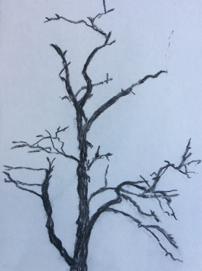
Several oak trees had dead uppermost branches (although the branches below were clothed in leaves). I made a charcoal sketch because I am particularly interested in the silhouettes – they almost feel eerie and menacing. 
A separate oak in the centre of the park showed interesting “lop-sided” ovals where lower branches had been cut. 
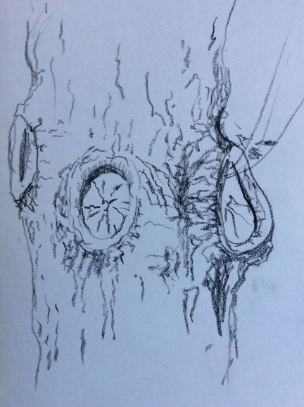
I was really attracted to the different shapes and textures and I feel that there is a lot of scope for simplifying and developing this imagery. At the moment it is suggesting a printing project or pattern development.

A smaller oak tree interested me because it had lots of fine growth protruding horizontally from the main trunk – The areas where the growth originated were gnarled and knobbly.  I like the contrast between the fine shoots and the thick heavily textured bark, although I’m not sure at the moment how I could develop this drawing/idea.

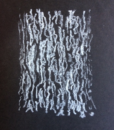
I made an analogy of the bark texture using white Conte pencil on black paper, which is simplified in terms of tone, concentrating instead on the shapes made by areas of light and shade.
Finally, I took two bark rubbings from an oak tree trunk. The first is using a charcoal block:

I love the quality of these marks, and would love to be able to reproduce this somehow in textile, possibly with an inkjet printer onto fabric. It would need to be combined with another technique/project which needs some thought as I continue to develop my other samples/analogies.

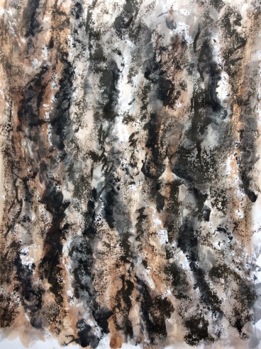
The second rubbing I made was using wax candle. When I got home, I applied a wash of Indian ink, Koh-i-noor dye-based watercolour, and an application of oil pastel to achieve a highly textured surface.
 

Walnut bark:

Using the same methods as above, I made two similar analogies from walnut bark. The texture was quite different and much more regular.
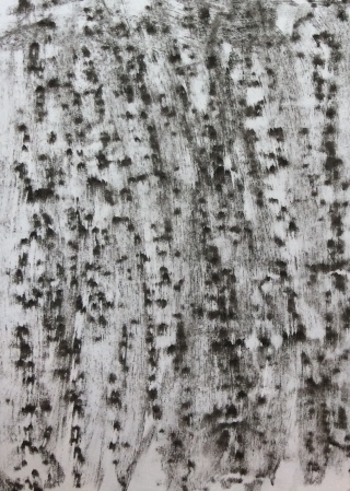
Above is the charcoal block rubbing.

And next a candle wax rubbing with ink wash and oil pastels. Thinking about textile analogies, what I would not want to do is make a representative textile copy. I will have to give some thought to how or whether I develop this idea further.

Yew tree:

This is my least favourite analogy (which I have included for completeness!). It is a charcoal drawing of a large yew tree. The tree was interesting because it was multi-stemmed – having lots of almost vertical main trunks, with many almost horizontal secondary branches and clothed in fine frond-like leaves/needles. I feel that the charcoal was too heavy and thick to capture this properly.


Coppiced willow:


In deciding to make this pencil sketch, I was attracted to the colour variation in the new leaves, and the contrast between the rough, thick trunk and the soft new leafy growth. My plan is to start with a colour study and maybe try and match some of the textures with fabric or yarn/thread.

Pine trees:

The pine trees at Thornham walks were quite different to the species at Snape. Smaller and with drooping U-shaped branches. My first sketch is a soft pencil drawing in which I try to capture the silhouette of the pine branches and understand how they cross each other and in which directions the needles are pointing.
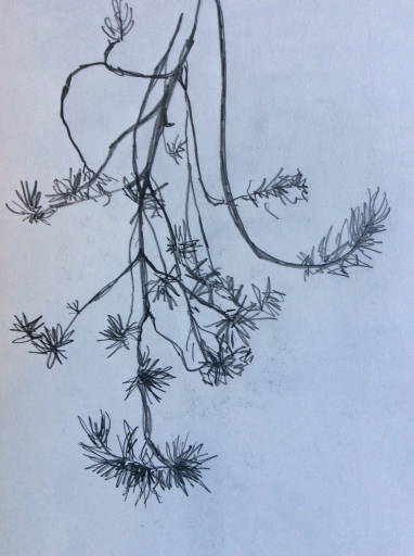
My second sketch is a different tree and probably a different species again. The new growth had pinkish-brown tips and a distinct shape and density differences. I am thinking about simplifying these and arranging them to make a pattern.

Summary:

The work presented in this blog and the one before represents the first stages of my sketchbook work towards Assignment 5 of Textiles 1: Exploring ideas. I anticipate a few more sketches and certainly more development work and experimentation before I start to make samples. I would normally not duplicate my sketchbook in it’s entirety online, however as work-in-progress it needs to be retained over the next few weeks for reference. 


Ash tree – experiments

30 May 2016

The theme I have chosen for my next project/assignment is trees. One of my sketches was of an ash tree branch, made in gel pen (below: image 1).

I wanted to play on the delicacy and “confusion” of the image – lots of tonal differences, confusing shadows, movement of the leaves in the breeze, and interesting negative space.

I started by scanning and printing the image, so that I could work into it with different media.

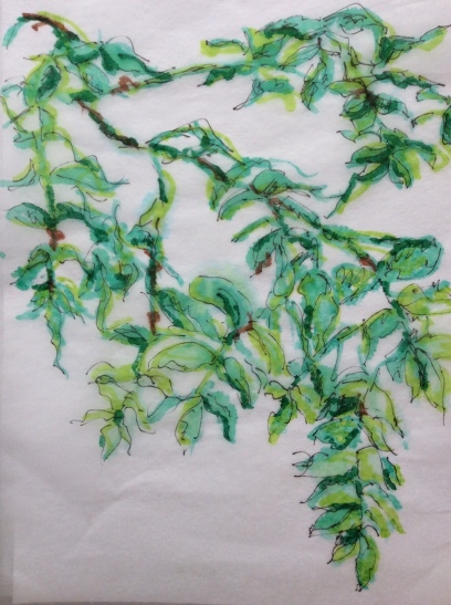
The first analogy I made was to ‘shade/colour’ the leaves using Koh-I-Noor dye-based watercolours. I used the dyes in greater and lesser concentrations to achieve blended tones over the surface. I purposely let the colours bleed and wash over the pen outline to soften the effect (image 2, below).

 Next, I took the copied outline and placed a piece of Japanese tissue paper on top.

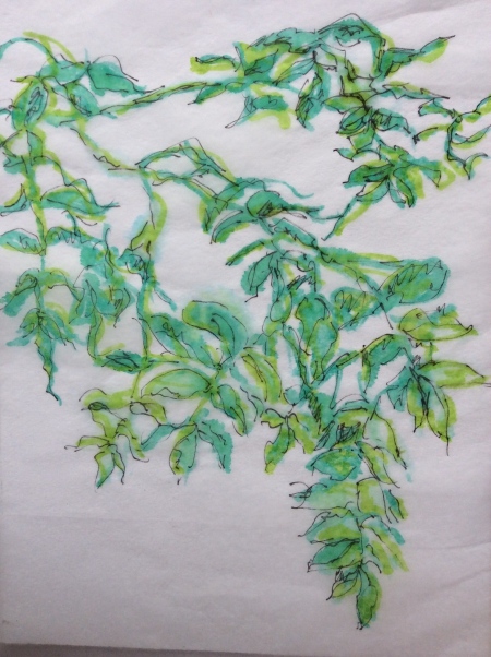
The image above is the first stage (image 3) – tracing the leaf shapes from the image underneath (I painted them using “Viridian” colour Windor & Newton ink). As I worked onto the Japanese tissue, some of the colour bled through and onto the paper underneath.

Shown above is the second stage (image 4). Still with both layers, I have used a black Pitt pen to trace the outline onto the Japanese tissue.


Thirdly, I highlighted areas of leaf using a pale green felt-tip pen (image 5). There are still two layers at this stage; the initial outline with the Japanese tissue on top.

Above is the outline image which was underneath the Japanese tissue (now coloured) – there is a pleasing mottled affect as the ink and felt-tip pen has bled through the Japanese tissue (image 6).

Above is the Japanese paper removed from the outline image and placed on a plain piece of white paper (image 7).

Finally, I worked into the Japanese tissue image further using brown and dark green felt-tip pen (image 8).

There are lots of subtly different effects which I have achieved in this series of experiments. In particular I like image 6, where the pen and ink has gone through the Japanese tissue to colour the paper underneath. I am also pleased with image 5. The effect of having the overlay of Japanese tissue has given the image a ‘doubled-up’ or 3D effect. Both these images suggest movement and changing shadows. Thinking about textile sampling, these analogies are highly suggestive of freehand machine embroidery and sheer fabric appliqué.

Union flag – samples

February 2016

I had some left-over dye paste and some ideas about how I might depict the Union flag for my project on identity.

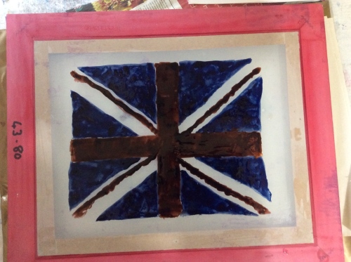
Breakdown printing was a technique which I had really enjoyed in my experimentation for the screen printing assignment (assignment 2 of Textiles 1:Exploring ideas). I wanted to take this further and see if I could replicate a design – the Union flag seemed a good choice.

I also needed to use up some left-over dye-paste, so the colour I used where what I had rather than what I would have chosen. I started by painting my design of the back of a screen using blue and brown Procion dye-paste, then leaving it to dry completely.

I then used yellow dye-paste to print the screen. The dried-on dye-paste broken down during sucessive prints, giving and every more disintegrated image. The order of printing was:

  1. Top left
  2. Bottom left
  3. Top right
  4. Bottom right

I think the effect is great and there are exciting possibilities for developing and sampling further. In particular, I could investigate a more intricate pattern, and maybe combining the prints with other (non-printing?) techniques to add more texture.

It would be interesting to look at the effect of different colour combinations too, including plain (undyed) manutex paste to print, which would have resulted in a background of white cloth. 

Next, I made a very fine stencil using newsprint. I wasn’t sure how sucessful the prints would be because the bridges were very small, and I hadn’t used this type of stencil before with print paste. I was pleased with the results.

I was using left-over print paste and scraps of different fabric (which had been pre-mordanted in soda ash solution). I got some different textures and shades of dye as a result.

One problem that I experienced was quite a lot of backstaining. I used cold water to rinse my samples, first in plain water, then with Colsperse. I think to eliminate the backstaining would just be a case of rinsing more thoroughly.


Colour studies with Procion dye

8 February 2016

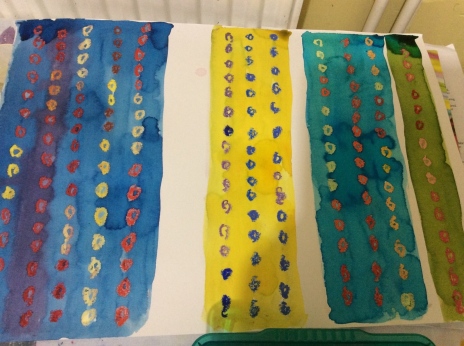
I have been wanted to experiment with colour and colour combinations for quite a white. I used my Sennelier oil pastels in combination with Procion dye to explore colour combinations.

I am really pleased with the results. The oils pastel resists the water-based ink giving an interesting texture to the circles. By subtly changing the colours it was possible to explore which gave the most interesting contrasts.

I went on to explore a particular colour combination which I had come across in one of Kafe Fassett’s knitting patterns – olive green with cerise pink.

I also used lime green and I let the dark olive green colour bleed into the lighter shades.

I made a second study where I stood the paper up and let the colours dribble down. I prefer the first study, however, which doesn’t include lemon yellow.

Studio work – bread texture

7 February 2016

I have been trying to concentrate, not just on drawing and sketching, but developing my drawings with different media, fabrics and samples. One image which particularly interested me was a photograph of some bread rolls.

I started by drawing a couple of analogies or the surface textures.

I am really pleased with these analogies because I feel that my observational and drawing skills are much improved. In turn, this is helping me to better understand texture.

I went on to make some outline drawings and collage.

I have plenty more ideas to develop this theme further.

The natural history museum again

11 February 2016

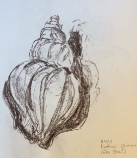
There are just so many interesting exhibits at the natural history museum that it can be difficult to know where to start. I had recently bought some Derwent XL graphic bars, so I spent time doing a warm-up exercise, sketching a sea snail shell and getting to know the medium.

I made the drawing in A3 because the graphite block would have made a smaller drawing very difficult.

I then spent time doing a detailed drawing of a giant clam shell, also A3. I was particularly interested in the negative space created between the shell, the variety of texture and value of the shadows.

The sketch is unfinished, because I had not brought the right media. I started with a black wax crayon, but I needed a really fine line for the shell layers. I only had an HB pencil. Without different softnesses, I couldn’t achieve the range of values that I needed for the shell surface and the shadows inside.

My final sketch was another skull (A3). I am frustrated with the standard of my skull drawings – I would like to be better.

I used one of the Derwent graphite blocks for this sketch, which made it difficult to achieve the detail I needed on the teeth. Ideally I would have had a charcoal or soft graphite pencil with me too. Once I got to this stage of the drawing, I would have liked to go back and take out some highlights with an eraser. Unfortunately I didn’t have one with me! 

I haven’t attempted to finish the sketches at home because I tend to find it is unsuccessful without the subject as reference.


Some sketches of my son asleep

3 February 2016

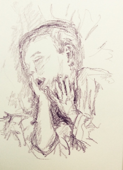
I had a wonderful opportunity to sketch my son as he lay asleep. Good practise with foreshortening and working in the half-light I find my inability to see what I am putting down on paper helps to keep my left brain in check!

I started with a pencil sketch of his bare feet. I’m really pleased with the angles, depth and perspective.

My second pencil sketch was of him laid on the bed. I had intended to get his whole body in the drawing, but in the event I ran out of paper.

My final sketch is using a wax crayon (Neo-colour, although I have not applied water). I like this medium because it invokes a softens with it’s thick lines and grainy texture. He was laying in a strange position, but nonetheless I do feel that I have drawn the forearm too short.

A few more sketches at the natural history museum

3 February 2016

I spent an hour stitching at the natural history museum again today. I was drawn to a human skeleton and make several sketches of sections of it. I only had an A5 sketchbook, so didn’t attempt to draw it in it’s entirety.


Knee cap – must first drawing and I was still apprehensive/getting into my stride.

Arm – a smaller version would have been better, to put the radius and ulna in context of the hand.

Foot – a slightly unnatural pose, but the toe bones were wonderful to draw. Lovely negative spaces between them and lots of lumpy bone texture. I felt relaxed and fluent with my drawing by this stage.

Lower spine – Again, I enjoyed focusing on the negative space between the spinal processes. A lovely section to draw.

Finally, I attempted to draw the skull. It was most difficult and I’m not really happy with this sketch, although I like the teeth. By this time lots of school children had come into the room causing me distraction and unwanted attention. I decided to call it a day and make this my final drawing!

Sketching at the Ipswich natural history museum

15 January 2016

After my visit to the Magnificent obsessions exhibition on the 8th Jan, and seeing Damien Hirst’s collection of taxidermy, I remembered that we have an excellent collection of bones, fossils and stuffed animals at the Ipswich natural history museum. I took my sketchbook along. I made a conscious decision to do all my sketching in biro pen. I wanted to get away from trying to make a ‘good’ drawing and concentrate on capturing the important elements of the objects for my textile work. All the objects were in glass cases, which limited the angles from which they could be viewed.

First, I sketched a red deer antler. I liked the different textures and grains in different parts of the horn, and how the patterns flowed along it’s length.

My second sketch was of the foot of a red colobus monkey taxidermy specimen. Being a stuffed animal, the toe pads were rather shrivelled. However, I liked the texture of the fur which was longer in some areas than others, and the dimensions and curve of the toes.

I enjoyed drawing the pig-tailed macaque taxidermy head. It was enjoyable to draw. Unlike human portraiture, I did not get hang-ups about the ‘face’ and the importance of the features. It was just natural.

I was interested in the negative shapes of this brown bear skull and the different textures and shadows across it’s surface. Unfortunately, I ran out of space on page. Rather than squash up the image, I let it run off the page. It was a shame because the nose area was also interesting.
Finally a sketched a rainbow Lordy taxidermy specimen. It was displayed wings spread out to show the underwing colouration. Maybe the subject for a colour study?

I made all these sketches in about an hour. I hope to return to the museum again, as there are lots of other specimens that I would like to draw, including, butterflies, fish, shells, a boa constrictor skull, and many more bones and teeth.